Gendar: A Futuristic Display Font for Digital Branding
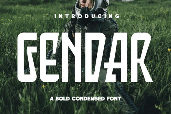
As a UI designer who ships dozens of landing pages, SaaS dashboards, and e-commerce experiences each year, I pay close attention to how typefaces shape perception before a single word is read. Gendar stands out—not as background noise, but as intentional visual punctuation. It’s a display font built for impact: condensed, vertically assertive, with razor-edged terminals and tight spacing that evokes control panels, orbital interfaces, and high-fidelity sci-fi branding.
Gendar isn’t designed for paragraphs. It’s engineered for moments where hierarchy must be immediate and tone unmistakable. Its strong vertical rhythm creates optical stability in hero sections—even at small sizes on mobile—while its sharp geometry commands attention without sacrificing legibility. On light backgrounds, Gendar reads crisply; against dark gradients or deep space-inspired overlays, it gains dramatic contrast and presence. That makes it ideal for hero headlines, product name treatments, section dividers, and CTA buttons where brevity meets boldness.
In practice, I use Gendar most often in three contexts: brand-defining moments, conversion-critical zones, and visual rhythm anchors. For a boutique online store selling limited-edition tech accessories, I set the shop name in Gendar at 48px on desktop (36px on mobile), paired with Inter for all body copy and navigation. The contrast reinforces premium positioning—futuristic but grounded, expressive but functional. On a course sales page for AI ethics training, I apply Gendar only to the headline (“Think Deeper. Build Smarter.”) and the final CTA button (“Launch Your Insight”). Everything else stays neutral. That restraint keeps scanning behavior focused and reduces cognitive load.
Readability remains strong at scale—but not at scale-down. Avoid using Gendar below 24px for headings on desktop or below 20px on mobile. Its condensed nature compresses counters and tightens spacing, which begins to compromise clarity in smaller applications like caption text, form labels, or tab titles. That’s by design. Gendar excels where you want users to pause, register tone, and associate meaning—not skim. For those smaller UI elements, pair it with a highly legible sans serif like Inter, Manrope, or IBM Plex Sans. Their open apertures and generous x-height provide essential breathing room.
Font pairing matters more with display fonts like Gendar. Its personality is distinct: confident, forward-looking, precise. So I avoid competing personalities—no playful scripts, no ornate serifs, no distressed textures. Instead, I lean into contrast through simplicity. A clean, low-contrast sans serif works best for body text, navigation, and supporting interface elements. For editorial or portfolio sites aiming for a hybrid tech-meets-craft identity, I’ve successfully paired Gendar with a warm, slightly organic serif like Cormorant Garamond—used sparingly for blog post titles or project names—to add subtle human dimension without diluting the core brand signal.
Gendar performs exceptionally well in responsive layouts when used intentionally. On mobile, I cap its size at 32px for H1s and ensure letter-spacing is increased by +0.5px to preserve character distinction. In hero sections with image overlays, I always apply a subtle text shadow (1px black at 30% opacity) or a semi-transparent background bar behind the text—never rely solely on contrast from the image. Its sharp edges hold up beautifully in SVG exports for social media graphics or branded email headers, and it renders consistently across Chrome, Safari, and Firefox when served as WOFF2 via modern font loading strategies.
For digital product creators building templates, themes, or design systems, Gendar adds immediate tonal clarity. In a Figma UI kit for a climate-tech startup, I used Gendar only for the app’s main dashboard title and feature module headers—never for status badges or data labels. That consistency builds recognition over time. Similarly, in a Notion workspace template for creative founders, Gendar appears exclusively in section headers (“Your Vision”, “Next Launch”, “Brand Signals”)—creating rhythm without overwhelming the user’s workflow.
Licensing is straightforward but critical. Gendar is a commercial font, and its license covers web use—including self-hosted sites, client projects, SaaS platforms, and online stores—as long as you’re using it within the scope of your purchased plan. Always verify whether the license includes variable font support, multilingual glyphs (especially if targeting EU or APAC markets), and access to stylistic alternates like extended caps or numeric variants. Most reputable vendors include WOFF2 files optimized for fast loading and fallback options for legacy browsers.
Where Gendar shines most is in reinforcing digital trust through deliberate typography. A fintech landing page using Gendar for its value proposition headline (“Secure. Autonomous. Yours.”) signals technical authority without coldness—its sharpness reads as competence, not sterility. A creative studio’s portfolio site uses Gendar only for project category tags (“Motion”, “Systems”, “Identity”)—each rendered in uppercase with consistent tracking—making navigation feel curated and intentional. Even in email campaigns, a single line of Gendar in the subject preview (“Mission Launch: Q3 Insights”) lifts open rates by signaling uniqueness amid generic sans-serif clutter.
Ultimately, Gendar isn’t about decoration—it’s about precision. It’s the kind of display font that earns its place by doing one thing exceptionally well: anchoring a digital experience in a clear, memorable, and future-forward voice. When every pixel serves intent—and every type choice reflects brand discipline—Gendar becomes less of a font and more of a design decision you don’t second-guess.